Why we made Open Huninn
Many Traditional Chinese fonts do not include the characters people in Taiwan use every day. I based the project on the rounded design of Kosugi Maru and Varela Round. The Japanese source lacked thousands of Traditional Chinese characters and placed punctuation differently from Taiwanese text.
The aim was to make that style useful for everyday writing in Taiwan, including languages and characters that common fonts often leave out.
Regional character forms were one reason that filling the missing code points was not enough. The same Unicode Han character can have different stroke structures in Traditional Chinese, Japanese, Simplified Chinese, and Korean conventions. A Japanese source glyph may render without a missing-character box and still look wrong to a Taiwanese reader. I reviewed the Taiwanese forms and adjusted the new outlines to fit the local standard, rather than assuming one pan-CJK glyph would suit every region.
 Open Huninn combines rounded Han characters with Bopomofo and Latin text in a Taiwanese sample.
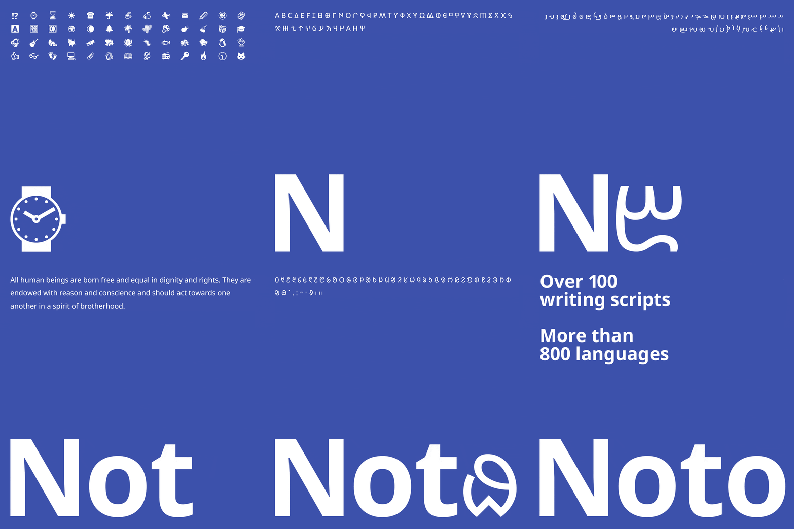 The same Han character can have different accepted forms in Chinese, Japanese, and Korean typography.
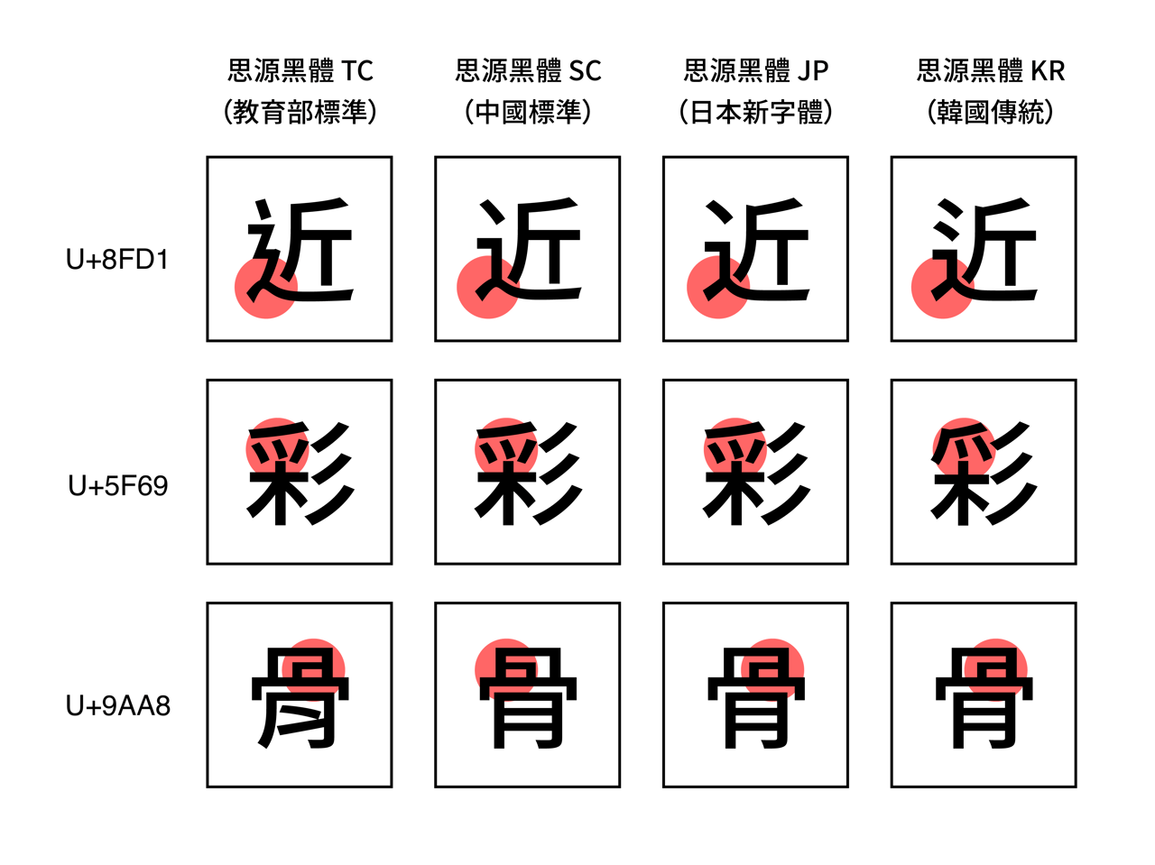 One code point appears in four regional forms, so coverage alone does not guarantee the right glyph for Taiwan.
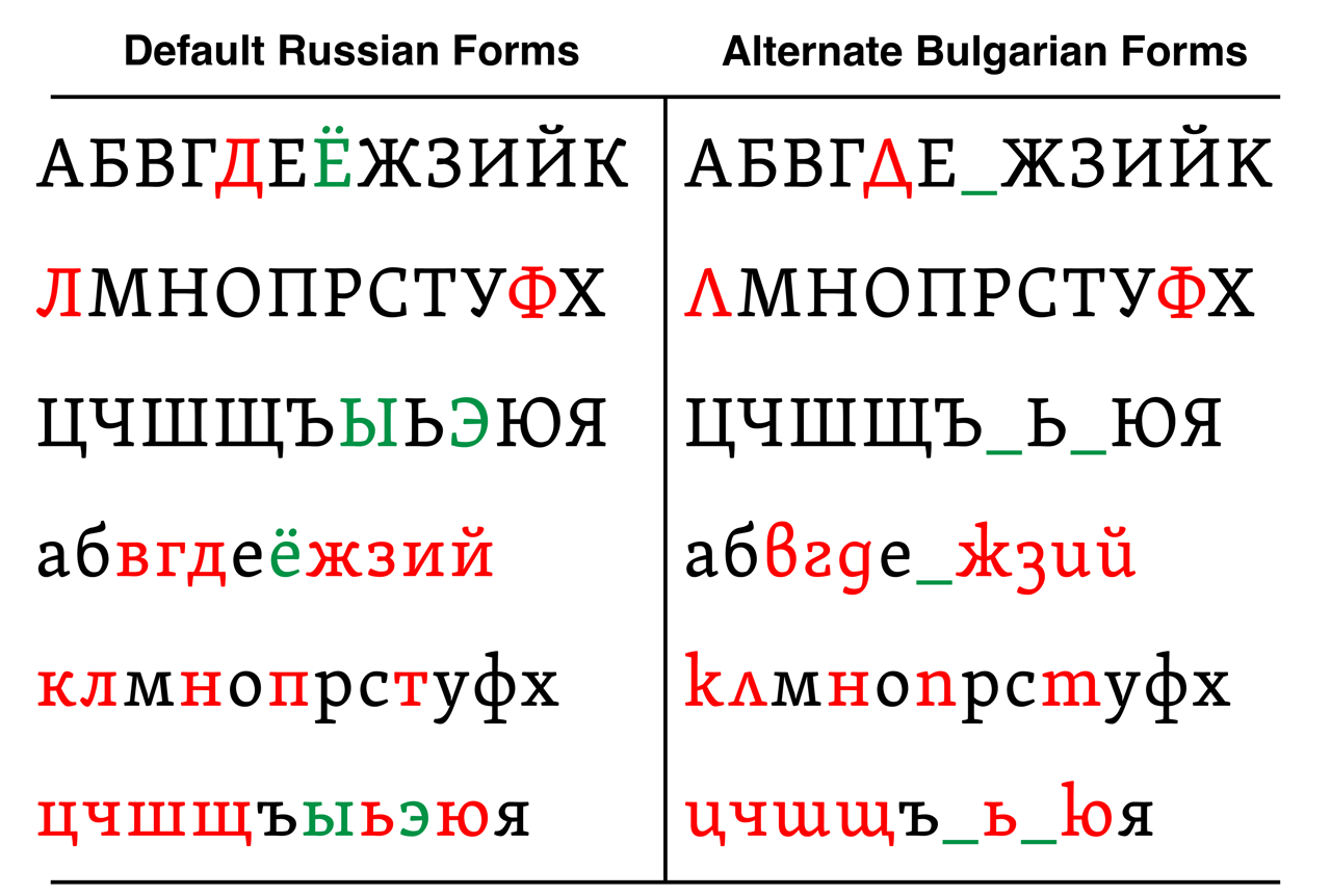 Russian and Bulgarian share some Cyrillic letters but draw several of them differently, much like regional Han forms.
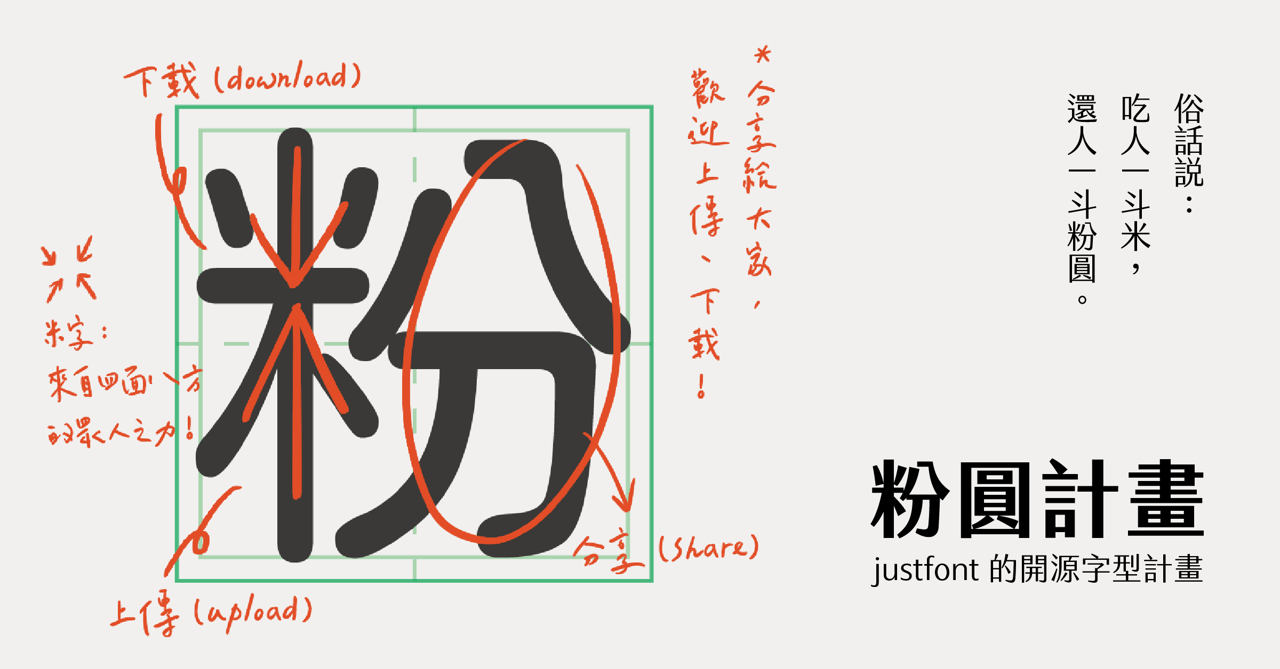 The rounded typeface extends a Japanese design source with Traditional Chinese and Taiwan-specific language support.
Filling gaps in the character set
I designed hundreds of new characters and built a repeatable process for preparing the font. The project added 3,547 frequently used Traditional Chinese characters, along with Bopomofo and characters used to write Taiwanese Hokkien, Hakka, and Indigenous languages. The Japanese source covered only about 2,000 Chinese characters, so the extension was essential for avoiding missing-glyph boxes in everyday Taiwanese text. The added set was selected around frequent Traditional Chinese use and Taiwan-specific writing needs, rather than expanding an abstract character count alone.
We also adjusted punctuation for Taiwanese reading. Japanese punctuation sits in the lower-left of the character grid, while Taiwanese punctuation is centered. I repositioned those marks and reviewed spacing alongside the new glyphs to make mixed Chinese, Bopomofo, and Latin text read as one coherent family.
Character coverage was only one part of making the family feel local. The same passage can mix Han characters, Bopomofo, Latin letters, and tone marks, so their proportions and spacing need to feel related on the page. I worked with the type designer to compare those combinations in actual text samples, adjusting the new outlines and punctuation together rather than treating each character as an isolated drawing.
That difference appears across ordinary paragraphs, so it can make a typeface feel imported even when the letterforms are attractive. Repositioning punctuation and balancing the gaps between Chinese, Bopomofo, and Latin glyphs made the source style fit Taiwanese typesetting, not just cover more characters. The punctuation comparison became part of the review alongside the character chart and text specimens.
The source outlines were also drawn for lower-resolution screens. Their heavier outer strokes and thinner inner strokes helped at the time, but looked uneven on modern displays and in print. I rebalanced stroke weight, character spacing, and proportions across the family while preserving the rounded style, so the thousands of added characters did not look like a separate set pasted onto the source font. I checked the overall grayscale of text blocks as well as individual shapes; a page of Chinese text can look patchy even when every glyph appears acceptable on its own.
A typeface with thousands of characters cannot be checked by hand after every change. I built a Python production pipeline with FontTools to merge source files, check coverage against target character sets, export TTF, OTF, WOFF, and WOFF2 from the same source, and catch errors before release. It also prepared the metadata and files needed for Google Fonts review, turning repeatable release checks into part of production rather than a last-minute manual pass.
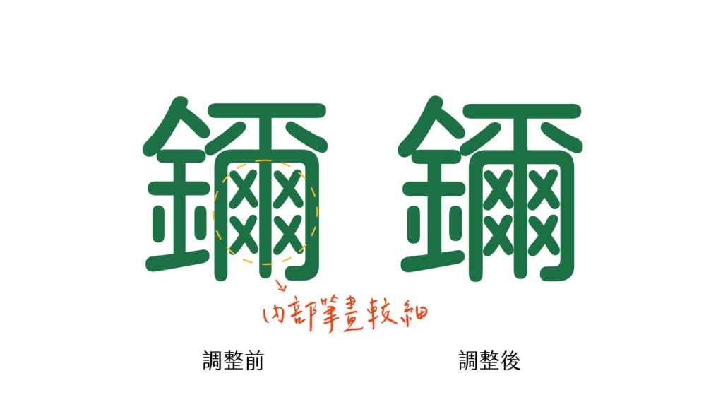 The added glyphs were adjusted to match the source family’s stroke weight and proportions.
The work was tracked against a coverage chart spanning 83 pages, so designers and engineers could see which characters had been added or revised. This mattered because a font can look complete in a short specimen and still fail as soon as someone uses a name, a place, or a language-specific mark outside the common set. The chart also served as a shared review surface: the type designer could compare new glyphs with the source style, while engineering could trace character coverage through the build. A sample of a few common characters could never prove that a 7,000-character font was ready for everyday writing.
Those pages made a year-long body of work reviewable in manageable pieces. A designer could focus on visual consistency across a chart page, while I used the same coverage list to check that the build included the intended characters. When a glyph changed, the team could see where it belonged and compare it with related shapes. That reduced the chance of finishing the headline characters while leaving uncommon but important names or language forms missing.
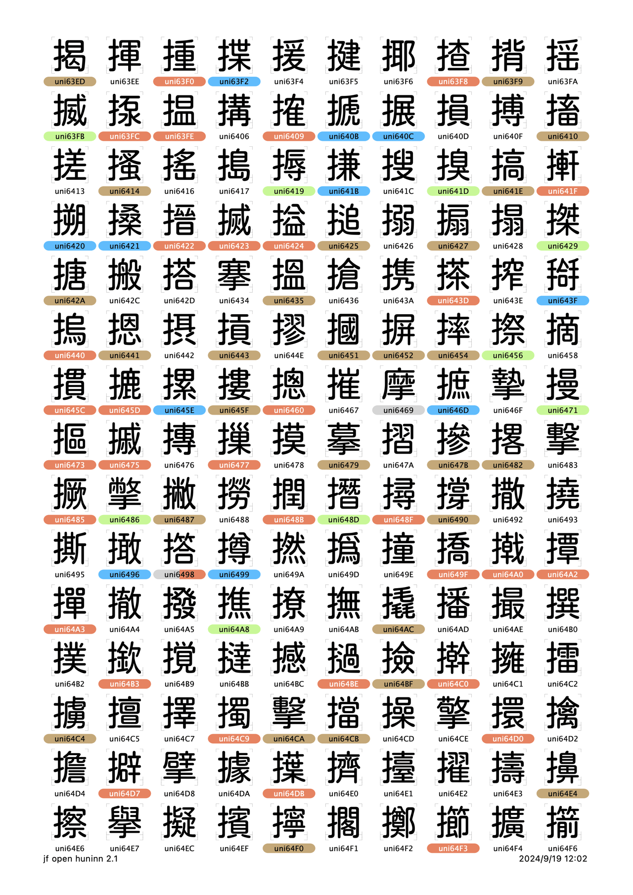 One page from the 83-page chart tracks the 3,547 characters added beyond Kosugi Maru.
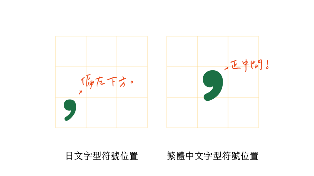 Taiwanese punctuation sits centered in the character cell, unlike the lower-left Japanese placement.
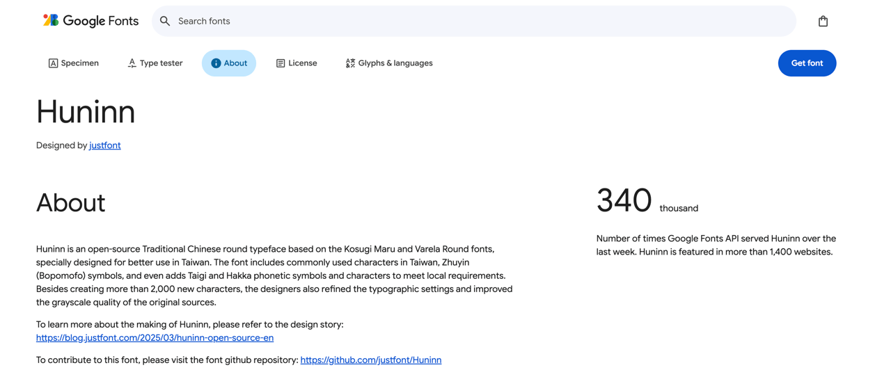 The published family is available through Google Fonts for web and design projects.
Meeting the standards for Google Fonts
Publishing to Google Fonts required passing automated checks and responding to reviewer feedback. Those checks covered details that can be easy to miss locally, such as naming, character coverage, and how the font renders in different software.
The production pipeline made these checks repeatable. Each release validated the expected character sets, prepared desktop and web files, and checked the metadata before submission. The font went through repeated fontbakery and gftools checks, followed by reviewer feedback on naming, metadata, coverage, and rendering. I updated the package through those review rounds until it met Google Fonts requirements. The font is published under the SIL Open Font License, so other people can use and build on it. Its open source release has since supported related projects such as Inherit TangYuan and TaiwanPearl.
What changed
Open Huninn has been downloaded hundreds of thousands of times and is used in schools, government documents, and commercial work. It is available through Google Fonts, and other designers have built new typefaces from it.
The public release also changed who could extend the work. The SIL Open Font License allows other designers to modify and redistribute the font, and related projects have adapted it for additional needs. Keeping the source and build process open made those derivatives possible without asking the original team to create every specialized version itself.
The project showed me that language support is part of a font’s design. A font becomes useful when it reflects the way people actually write, not only the way its original source was made.
The project was a joint design and engineering effort. I worked on the glyphs and the production pipeline with the type designer, then carried the resulting family through Google Fonts’ review process. Open Huninn became one of the first open source rounded typefaces designed for Taiwan and is now used across education, government, and commercial work. Its derivatives show how a well-covered open font can become a base for more specialized work rather than a one-off release.
The regional comparison images explain why the source font needed this careful extension: a character can exist and still be the wrong form for its readers. The glyph chart and punctuation examples show the less visible production work behind the release, while the Google Fonts listing shows the result in a place people can actually find and use it.
Making this available as an open font gave educators and publishers a practical choice for Taiwanese text without asking them to assemble a custom character set themselves.
It also gave other designers a clear source to build on when their projects needed a more specific regional or stylistic direction.