Why I made a mahjong font
Mahjong players share hands and explain strategy through screenshots, hand-edited images, or text that does not look like the tiles. Each option makes it harder to write, search, and reuse teaching material.
I wanted players to type a hand as text and have it appear as clear, consistent tiles.
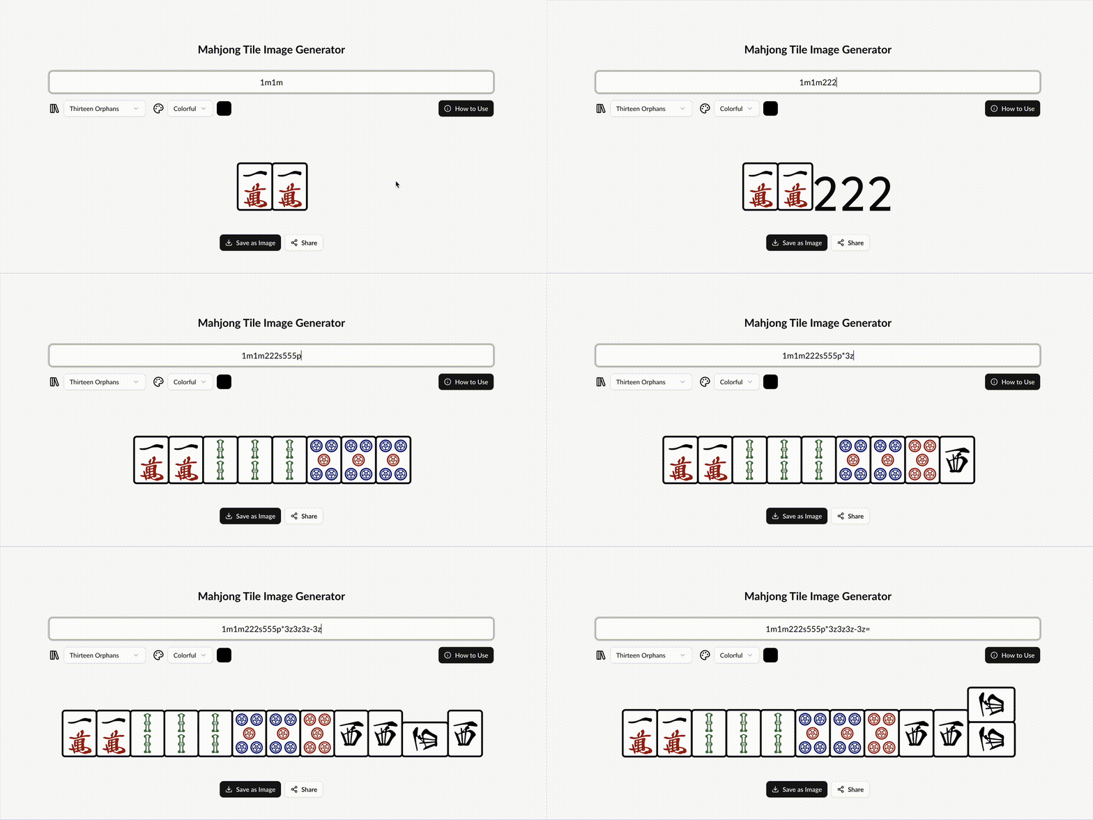 Typing a hand as text turns it into tiles, including red fives and called groups.
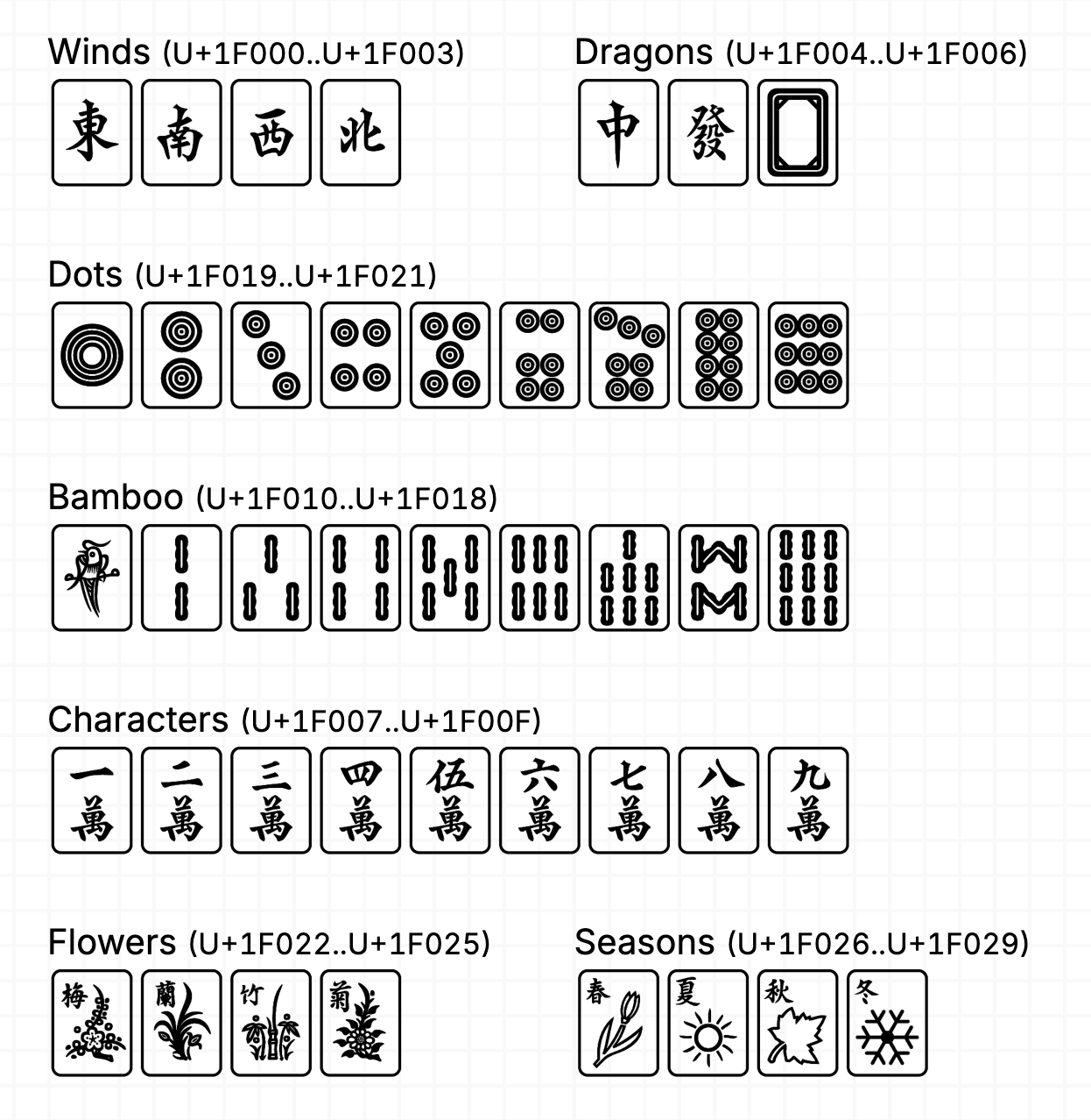 Unicode tiles vary between fonts and do not include every rotated form used to show calls.
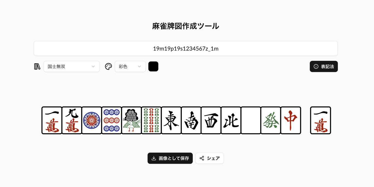 A custom notation keeps a mahjong hand editable as text while the font renders it as tiles.
Designing a notation players can use
The notation needs to represent the three numbered suits, winds, dragons, dice, and special red tiles without making people learn a long code. I used short forms such as 1m through 9m for characters, 1p through 9p for circles, and 1s through 9s for bamboo. Suffixes mark game states: * for a red tile, - for a called and rotated tile, = for a promoted kan, and 0 for a face-down tile. Spaces and underscores can show gaps between groups.
Honor tiles use 1z through 7z, while dice use 1. through 6.. This gives a hand a compact text form that is still recognizable to a player. A red five can be written 5m*; a called tile can carry -; and a concealed group can use 0 for the face-down faces. The notation is designed to be typed in an ordinary editor, then copied into a post or lesson without any custom character picker.
The font turns that notation into tiles using the COLR/CPAL v0 color-font format. The vector layers scale cleanly in browsers and desktop design tools, and the font stores base tile artwork that OpenType substitutions place and transform for each notation pattern.
I chose the color-font format because the same font needed to work in the browser playground and in design or publishing tools. Vector layers keep tiles crisp at different sizes, while the monochrome version remains useful for contexts where color printing is unavailable. Using the font itself to recognize a notation sequence also means the saved text stays searchable and editable after it has been posted.
That last part created a trade-off. The font format matches exact sequences, so every suit, tile, and modifier combination needs a rule. I kept the rules hand-written in the feature source with a strict naming convention for tile, modifier, and orientation, rather than hiding them behind a generated translation layer. This made the shipped substitutions auditable even as their number grew. I also used substitutions to reuse and transform base artwork into related tile forms, which cut the font file size by about 60% while keeping the notation expressive.
This was a deliberate choice for future contributors. A script could have shortened the source, but the people most likely to add tiles or fix a rule are type designers, not programmers. Keeping the actual substitutions visible in the font project made the behavior easier to inspect and edit where the artwork lives.
The notation has a lot of combinations: three suits, numbered tiles, honors, red variants, called tiles, concealed tiles, and different group orientations. The exact-match rules therefore number in the hundreds. I kept a naming convention for tile, variant, and orientation, with comments that explain the combinations, so a type designer can trace a rule back to the input notation without learning a separate generator.
The rules also let the notation describe more than the face value of a tile. A called group can include the rotated tile that records where it came from; a concealed kan can show the back of its outside tiles; and a promoted kan can mark the tile that was added. The text preserves those game details while the font handles the visual forms. That is what makes it practical for strategy explanations, where arrangement and call state matter as much as the tiles themselves.
For example, a line of notation can keep a hand’s suits and honors in ordinary text while marking a red five or a called group with a short suffix. Readers can copy the source into a forum post or a lesson document, and the font turns the same sequence into a tile layout wherever it is installed. That makes notation easier to search and edit than a screenshot, while still giving readers the visual form they expect from a mahjong hand.
The notation also has to handle groups as players write them. A called group can be rotated, and a red five must look different from a regular five. I tested those cases in the playground instead of treating the font as a static specimen. This helped catch combinations that looked correct one tile at a time but became confusing in a full hand.
Making it easy to try
A font file on its own is hard to understand. I built a web playground where people can enter notation, switch between color and monochrome views, create an image, and copy examples for common hands.
This lets players try the system before installing anything. It also gives teachers a simple way to make a tile diagram for a lesson or strategy post.
The playground gives users a way to switch between color and monochrome output, copy notation examples, and generate images for posts or lessons. Built with Next.js, it server-renders the starting view and then supports live entry and preview in the browser. That helped make the font usable even for people who do not have a font editor or know how to install a custom font.
The playground is also where I tested complete hands instead of isolated tiles. Rotated groups, red fives, concealed tiles, and spaces between calls all need to remain legible together. Those examples helped catch cases where a rule worked for a single glyph but produced an ambiguous group in a full hand. The same tool lets a player copy the notation as text or export a tile image for a visual post.
The format also avoids relying on Unicode mahjong symbols for states they do not represent consistently. Standard tile characters can vary between fonts and operating systems, and do not provide all of the rotated forms used for calls. The custom notation makes those forms explicit and keeps the source text portable across the web editor, a plain-text post, and the font itself.
I also wanted the notation to be learnable from examples. The playground lets a new player enter a short sequence and immediately compare the text with its rendered tiles, including color and monochrome output. That feedback makes the suffixes easier to understand than a reference table alone, and gives experienced players a quick way to verify a more complex hand before sharing it.
The accompanying images show the key shift in the project: from platform-dependent tile symbols to a consistent notation that can describe calls and concealed tiles. The playground then demonstrates the notation as something people can use, not just a font feature hidden in a specimen.
What changed
Since launching in 2024, the playground has processed more than 15,000 notation entries. Players and educators use it to create strategy content and teaching materials, and other mahjong projects have adopted the font. I released it under the SIL Open Font License so the notation and artwork can be reused and adapted by other projects. The result turns a visual format into something people can type, share, and search.